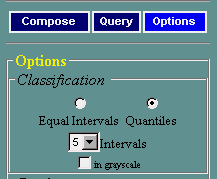
The map and the legend will be immediately redrawn. With the "Equal Intervals" method, the map will be shaded so that each interval spans an equal range of variable values. The "Quantiles" method orders mapping units (states, census tracts, etc.) by variable values, and groups them so that each interval has approximately an equal number of mapping units in it.
Choosing the right classification method is not always easy. Maps can look very different with different methods. For example, if distribution is skewed (the case with most social-economic variables), quantiles will in most cases produce a more "colorful" map. Think about the purpose of your map and the message you want to communicate when you select a classification technique.
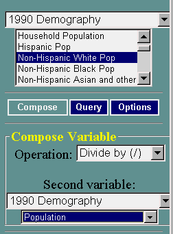 |
Compose and map a new variable. Click the Compose button,
and notice that a Compose Variable dialog box will appear below. In
this form, you can specify an operation (add, subtract, multiply,
divide), and a second variable to be used in the formula.
|
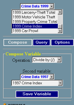 |
Save a new variable. If you want to construct more complex
indices involving more than two variables, you may need to temporarily
save the variable you are seeing on the map, and use it in further calculations. To do this, click on the "Save Variable" button. A window will open where you can modify the variable name if necessary. After you save the derived variable, it will be available under the <<Saved Variables>> dataset, as shown in the following picture. 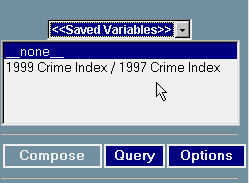
|