Controlling map settings in AxioMap
 In AxioMap , you can control several map display options. The Options control panel opens when you click the Options button. The panel is shown to the left.
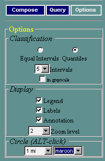
Here are the things you can change:
- Classification settings: control how the values of the current variable are grouped into color categories. You can choose between the "Equal Intervals" and "Quantiles" classification methods, and specify the number of intervals. Also, you can create your maps in color (default) or in grayscale. Read more about this on the page discussing mapping statistical data.
- Display settings: control visibility of certain map elements: legend, area labels, and annotation.
- Circle settings: control how the circles invoked by ALT-Click will be drawn on your map. You can set the circle's color and radius.
Note: this option is enabled only if the map is in lat/long or UTM coordinates.